top of page

Role
Design Engineer
Team
Just me :)
Timeline
May 2026 - Present
Introduction
Most of my design work happens on trading platforms, dense, real-time interfaces where the question is how much can we responsibly show at once, on a large screen, to an expert user. Alongside that, I've long kept a side practice that inverts almost every part of it: designing concept interfaces for the Apple Watch, a small, wrist-sized, always-glanced-at screen, just to explore ideas, what a flight tracker could look like, what a transit map could feel like, with no obligation to ever build them. Those concepts followed a principle I'd borrowed from high horology, where nearly everything, time, date, moonphase, power reserve, is represented on a circle or an arc rather than a straight line or a list. I carried that same logic into my own work, reaching for a dial or a sweep where convention would reach for a table or a menu, which is part of why these apps break from how most apps are built. A number of the original concepts are still up on the homepage of my portfolio, in the "Stash" section.
That constraint became the through line for three apps. xSun tracks the sun's position (Azimuth and Elevation) for photographers chasing the golden hour. xTransit is an NYC transit (Subway and Bus) navigator for people already in motion. xFlight turns my Apple Watch into a flight companion, following the trip from check-in to arrival. Three different domains, one design problem: how do you take a complex, constantly-changing system and compress it into something a person can read in a single glance.
One day I decided to stop treating these ideas as concepts and actually try realizing one in code, for a user (usually me) tracking a flight for themselves or a friend, commuting to work by transit, or checking the sun's position to plan a photograph, to see if an idea that worked as a static mock could hold up as a real, live, moving interface. xSun was that first attempt, and it's what pulled xTransit and xFlight along behind it.
Engineering Note
All three apps are built native in Swift/SwiftUI, standalone on watchOS — no companion-app dependency required to function, which shaped a lot of the data and caching decisions later on.

Problems

There's no room for explanation. A subway direction either reads instantly or the design has failed. There's no space for a legend, a tooltip, or a second look.

The content is inherently unstable. Sun position, train arrivals, GTFS-RT feeds, FlightAware's AeroAPI, and solar ephemeris math all return values that don't map cleanly onto a UI. The UI has to represent "live" without feeling twitchy or anxious.
Engineering Note
All three apps are built native in Swift/SwiftUI, standalone on watchOS — no companion-app dependency required to function, which shaped a lot of the data and caching decisions later on.

Attention is scarce and interrupted. Nobody sits with a watch face. They glance at it mid-stride, mid-boarding, mid-conversation, for one or two seconds, and look away.

The system doesn't speak the user's language. Transit systems, flight data, and solar data all describe things in operational terms that don't match how a rider, traveler, or photographer actually thinks about their situation.

Platform constraints actively fight the design. Menu isn't available on watchOS. Map tiles ignore colorScheme overrides. The simulator returns transit directions errors that don't reproduce on-device. Every screen had to survive contact with a real API and a real wrist.
Designing for the watch surfaces a different set of problems than designing for a phone or a desktop:


Process & Approach
I treated the geometry and rhythm of each screen as the core design problem — not something to solve after the "real" design was done.
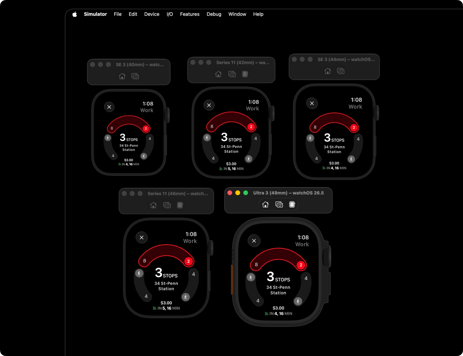
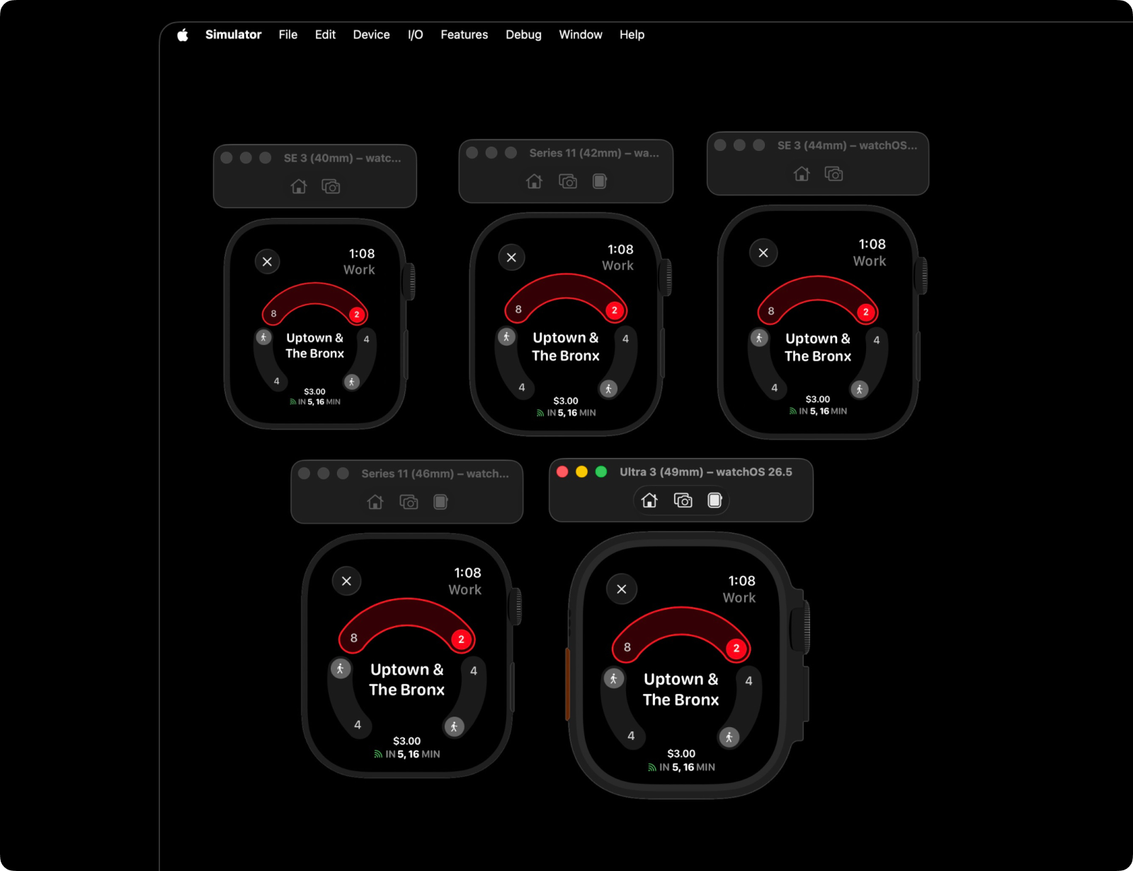
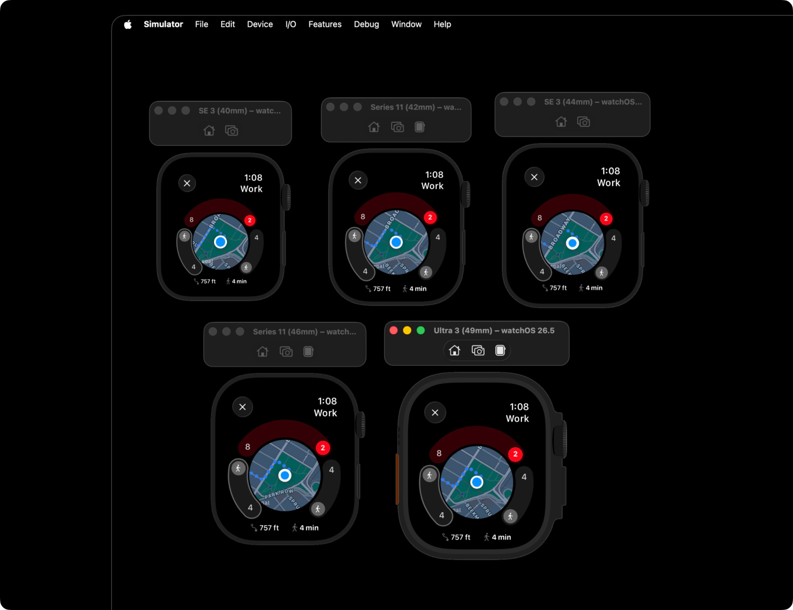
For xTransit, I designed the route detail screen as a continuous arc rather than a list, so a rider can see their whole journey — walk, transfer, ride, arrival — as one shape instead of a stack of rows to parse. Color became the primary navigation aid: each NYC subway line's color is used consistently everywhere it appears, so recognition happens before reading does. The biggest vocabulary decision was direction labeling — instead of showing the technical trip name a transit system uses internally, I designed the app to show the same phrase a rider sees on the actual platform sign, like "Uptown & The Bronx," because that's the language people actually navigate by.
Engineering Note
The arc is built on a shared GeometryReader coordinate space that every screen — search, results, route detail — draws from, so the arc stays geometrically consistent as data flows through the screen stack instead of being redrawn from scratch per screen. The platform-facing direction labels come from a PlatformDirectionsLookup I built against MTA's static GTFS feed, resolving each station's rider-facing sign text from raw stop IDs — the technical trip name and the platform sign text are two different data points in the underlying feed, and the lookup is what bridges them. I also generated a full reference set of ~400 NYC subway stations from GTFS data to ground search and routing in real stations rather than a hand-picked subset.


For xSun, I designed two complementary views: a compass-based direction view for "where is the sun right now, relative to me," and a wave-based phase view for "how does the sun move across my whole day." The design challenge was making the transition between day phases — morning, midday, golden hour, blue hour, night — feel like a gradient rather than a switch, since that's how light actually behaves. I used gradient backgrounds and a sun icon whose size and brightness shift with elevation, so the interface itself feels like it's tracking the light, not just reporting a number.
Engineering Note
Solar azimuth wraps at 360°/0° — a naive atan2 implementation produces a visible snap when the sun crosses north. The compass and phase views are built around azimuth-continuity math specifically so the wrist experience never jumps, with the sprite's opacity and scale driven by elevation and phase-to-phase transitions blended across narrow windows instead of cutting. Seasonal amplitude changes to the underlying wave keep the visualization accurate across the year, not just accurate in the moment you're looking at it.


For xFlight, I designed the experience as four distinct phases — check-in, cruise, arriving, arrived — each with its own information priority instead of one dense screen trying to do everything. Pre-flight, the design foregrounds gate and boarding time. Mid-flight, it shifts to ETA and progress. The phase isn't a visual skin — it's an editorial decision about what matters to a traveler at that exact moment, and everything else gets deprioritized or hidden.
Engineering Note
The four phases are modeled as an enum that drives the UI directly, rather than a set of boolean flags — each screen state maps to exactly one case, which keeps the "what does this phase show" decision enforced at the type level instead of relying on convention. Live data comes from FlightAware's AeroAPI via a dedicated AeroAPIService.swift, currently being wired up to replace the phase transitions I originally hand-simulated during design.


Design Decisions

Recognition over reading. Across all three apps, color, shape, and position do the work that text would do on a bigger screen. Line colors, phase gradients, and arc position are all designed to be understood peripherally, before someone consciously reads a label.
Engineering Note
NYC subway line colors live in one file, LineColors.swift, as a single source of truth — a color decision made once propagates everywhere it's used instead of drifting screen to screen as the app grew.

Say it the way a person would say it. The recurring content decision across the apps is translating system language into human language — platform-facing transit directions instead of technical headsigns, day-phase names instead of raw sun angles, flight-journey phases instead of raw flight-status codes. Naming is a design tool here, not an afterthought.

Design for the absence of a second look. None of these apps have onboarding, tutorials, or deep settings menus. Every screen was pressure-tested against a simple bar: does this read correctly at arm's length, in motion, in under two seconds? If a layout needed a caption to make sense, it was the layout that had to change, not the caption that got added.

Motion as meaning, not decoration. The sun's phase transitions blend rather than cut; the transit arc updates smoothly as a journey progresses. Motion in all three apps is used specifically to represent continuity in systems that are, in reality, continuous — never as a flourish.

Tech Constraints I Designed Against

Battery life as a design constraint. watchOS has an OLED display, where black pixels draw no power, so the visual system leaned dark and black-dominant by default as a power decision, not a stylistic one. Every animated element had to justify its battery cost on a screen meant to stay visible all day. xSun was the one exception, with warm gradients standing in for daylight — but even there, in always-on/sleep state the UI switches to a dedicated black-and-white view to conserve battery, rather than just dimming the color version.


Unavailability of certain components. watchOS required rethinking navigation affordances that would be trivial on iOS, such as the limitations in colorScheme in MapView, which meant the visual system couldn't fully control dark/light presentation inside MapKit views, so surrounding UI had to compensate.

No iPhone tether. Standalone watchOS apps can't lean on a paired phone for the heavy lifting, so data fetching, caching, and layout all had to work for someone who left their phone at home — a real scenario for a subway commute or a flight.
Engineering Note
xTransit combines live MTA GTFS-RT and BusTime data with Google's Directions API for walking legs, all requested directly from the watch — there's no iPhone relay step in the critical path, which matters underground where a paired phone might not have signal either.

Tap targets on a 41–49mm display. Interactive elements had to stay well above standard touch-target minimums while competing for space with information density, which meant deciding early what didn't get to be interactive at all.
Engineering Note
xSun's phase timeline uses the Digital Crown for scrubbing rather than a touch gesture — precise enough to move through a full day in fine increments, but forgiving enough that a small, imprecise wrist rotation still lands close to the intended time.
Where Things Stand
None of these started with any intention of shipping — they were personal projects, built to scratch my own itch for a glanceable, well-designed watch app. That changed once I started showing them to friends: the reaction wasn't "cool project," it was "can I have this," which is what pushed me from personal builds to actual TestFlight distribution. All three apps are now in ship shape, and I'm running TestFlight builds with friends chosen for each app's use case — xSun with photographer friends, xTransit with friends who commute daily, and xFlight with friends who travel often. xTransit's arc-based route visualization and consistent line-color language are holding up well across a full search-to-route-detail flow; xFlight's four-phase information architecture is in the hands of real travelers now, not just simulator states. That targeted rollout is where the design work is right now: gathering feedback from people actually using each app in the situation it was designed for, with a handful of new features already in progress based on what's come back so far. xSun established the visual language — gradients, phase blending, elevation-driven scale — that xTransit and xFlight both built on, and together the three apps form a consistent design practice: taking real-time, information-dense systems and translating them into something legible in a glance, on the smallest screen I've designed for. The next step is getting all three onto the App Store.
Learnings
Designing for a screen this small forced a discipline that's easy to skip on a bigger canvas — every element had to earn its place, because there was no room for anything decorative. The biggest shift in how I think about information design came from day-phase and direction-label work: naming and vocabulary are as much a design decision as layout or color, and getting them wrong is just as disruptive to legibility. The second: designing something you'll personally use fifty times a day changes your standards — I noticed friction in my own daily use of these apps far faster than I ever would have in a usability test, and that fed directly back into the next round of design.
Engineering Note
Being the designer and the engineer on the same screen meant every geometry and state decision — xTransit's arc coordinate space, xSun's azimuth math, xFlight's phase enum — had to be right early, because those are far more expensive to change after the fact than color or copy. On the next watchOS project, I'd spend more up-front time on each app's underlying structure before touching any visual design.
bottom of page